A new member experience for Tasmanians
St.Lukes is a Tasmanian health insurer, based in Launceston, with an ambition considerably larger than an insurance company usually has: they are working to make Tasmania the healthiest island on the planet.
The ask
Bring three separate products together, the Connect app, the Snug health app and the wellbeing platform to build a unified app; one place a member can use to manage their health insurance policy and their general health and wellbeing. The design system already existed, built by another vendor to reflect the St Luke’s brand. With that, we were to design the end-to-end journeys and screens required to bring the experience to life.

Healthy people, healthy island.
What I found
The design system looked finished but it fell over the moment real member information went into it. Components had been made without accommodating the requirements of real user data, so they broke when a member had four people on their card, or a long provider name, or a benefit description that ran to two lines.
In addition to this, an accessibility audit found the system had not been built to meet AA, and an insurer’s app is not a place where accessibility is optional. The people most likely to need it are the people most likely to be making a claim.
So the job we had been asked to do, roll out screens using existing components, ended up not being feasible. We had to rebuild the design system properly, stress testing the existing ones and designing any components that had been overlooked, which is a more complex piece of work with the same deadline.

A detail of the design system as it was supplied to us.

The same section of the design system remediated to include all states and pass AA accessibility requirements.

Updated componentry and a stronger reflection of the St Lukes brand.
What we did
I was part of the pitch that won the account and then led the design of the work we had promised.
We audited every element of the design system against WCAG AA and remediated it, so what came out could both meet compliance and grow as St Luke’s added to it in future. We rebuilt the components that broke when context changed, designing them with real member data rather than an ideal case.
We took the opportunity to more faithfully brand the design system at the same time. Typographically this meant swapping out Source Sans Pro, substituting their corporate typefaces into the app before we started designing individual flows.
For anyone already using Connect, the consolidation is a simple app update they have to accept before they can sign in again, a small price to pay for increased utility.
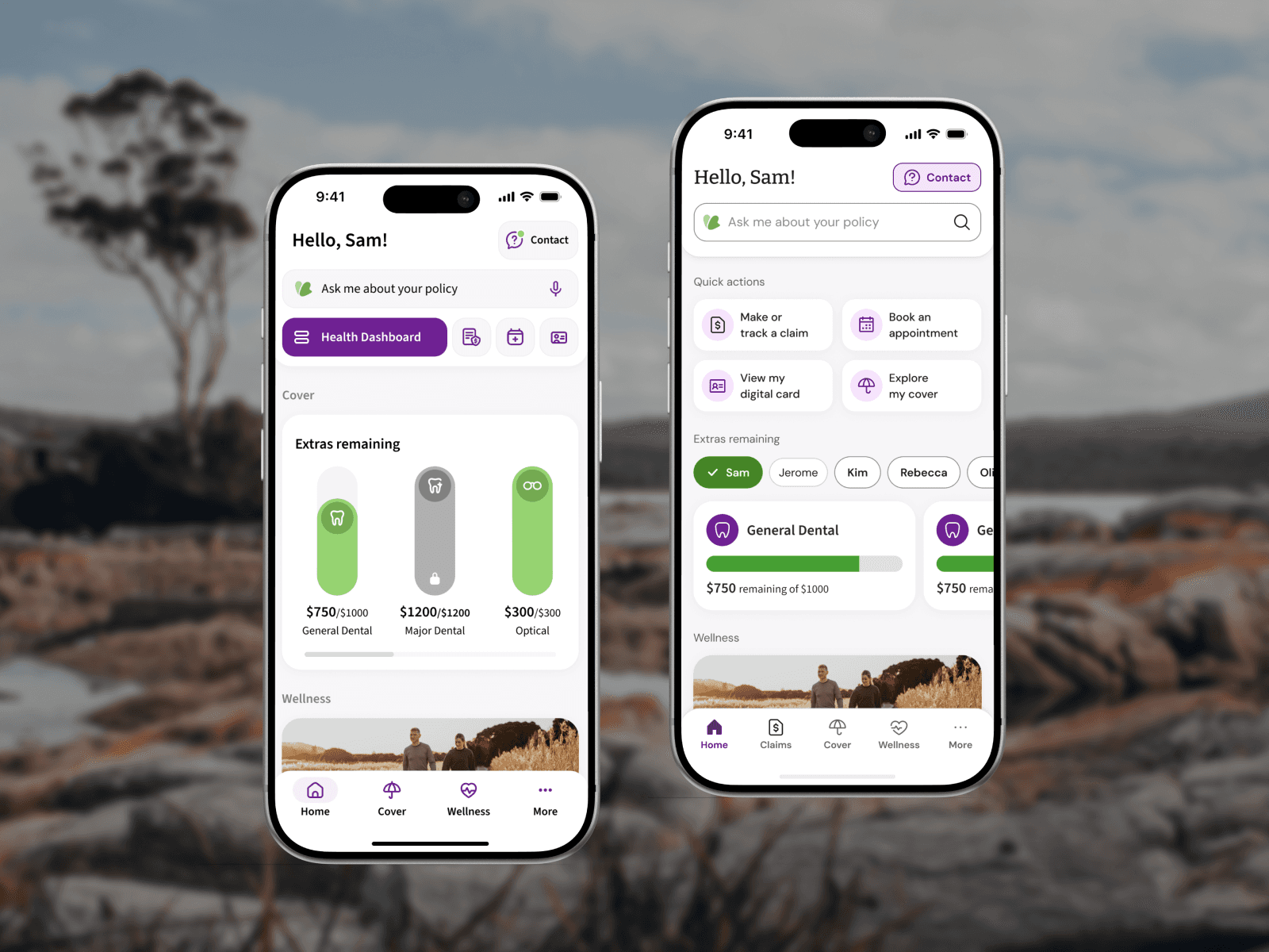
The dashboard before and after. We proposed a different way of showing limits that would not break if a member had a low limit left on a service, and moved what was behind icons into the tabs above into quicklinks that could be understood and actioned with a tap.
Where it landed
This is a three-year program that incorporates AI-assisted chat integration and it was still running when I left. At handover the design system was remediated and finalised, the foundations were laid, and Release 1 was defined and moving into development.
It also collected the kind of problem no roadmap accounts for. Partway through, the provider supplying the wellbeing platform went into liquidation, and the St Lukes team had to find a replacement for a capability that was already designed into the product. Long programs often fail in ways you cannot plan for.

The app interface is clean, simple to use, and most importantly, accessible.
What I’d do again
Auditing the design system before building on it.
We were handed something that had been signed off, paid for and presented as finished. Taking the time to find out whether it was true was the least popular decision available and the only one that made the deadline achaievable.
Client
St Lukes
Role
EXECUTIVE DESIGN DIRECTOR
responsibilities
Stakeholder management Project governance Brand direction Design system remediation Team management
DURATION
3 YEAR PROGRAM